Fundamentally, humans find comfort in familiarity. For this reason, Jakob Nielsen's second Usability Heuristic emphasizes the importance of consistency between systems and reality.
The principle is as follows:
When something happens in the system or when something needs to be explained, familiar words and concepts must be used to communicate with the user. As UX professionals, we must never assume that our interpretation and understanding of words or objects coincide with the user's understanding.
The way we interpret the surrounding world depends on various situational and personal factors such as:
- Our experiences
- Familiar items
- Beliefs
- Ideas and values
- And more
These factors contribute to the way we infer meaning, and the nuances of interpretation vary from person to person.
To understand this topic easily, let's consider some examples.
Approach with familiar language
If people do not understand the language used on a site, they will ignore the content and may have to look elsewhere for an explanation or to complete a task. (This is beneficial for SEO, as users often search using familiar words.)
Users should always be able to understand the meaning without having to look up definitions externally.
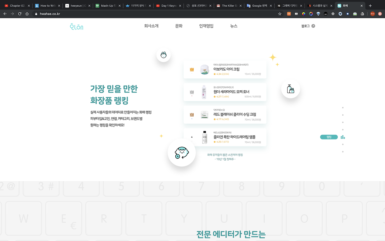
For example, the Hwahae app's website, which provides various information about cosmetics, offers clear, understandable headlines along with screenshots of the app to aid understanding.
As users explore the site, they see descriptions of the content offered by the app and reviews that build trust in the app.


Skeuomorphism Design

The concept of Skeuomorphism Design involves creating interactions that mimic reality, allowing people to build mental models or theories about how something should work in the system based on their past real-life experiences with the object. This helps users learn the interface easily without training.
Thus, users expect UI elements that reflect real objects to operate similarly to their real-world counterparts.
For example, the compass and calculator apps on the iPhone function almost identically to a real compass and calculator, but use preferred design elements like flat design and minimalism, including familiar elements and activities in the interface to facilitate easy use of the app.


In contrast...
If the interface does not match reality, it can cause confusion due to perceptual inconsistency.
For instance, we typically understand a left arrow icon to mean "go back" and a right arrow icon to mean "go forward." If the directions of these arrows are suddenly reversed, users may be unsure of the function of these icons.
Designing for consistency between the system and reality goes beyond visual similarities.
In various cultures, we establish metaphors that should be considered when designing interfaces.
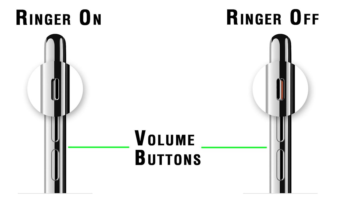
For example, the design of headphones where the volume increase button is placed above the decrease button uses metaphors intuitively.
Intuitively designed interfaces allow users to complete tasks without having to remember additional information.


Matching the system with reality is not only about words and objects; it also applies to the way digital experiences feel similar to real-world actions. For example:
- Sending a text message feels like passing a note.
- Browsing photos on Facebook feels like flipping through a photo album.
- Choosing a movie on Netflix feels like scanning shelves in a video store.
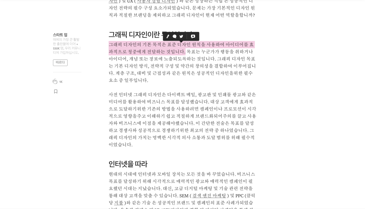
- Highlighting text on Medium feels like using a bright marker on a book.
Familiarity thus enhances the enjoyment of experiences.


Conclusion
While we have explained what consistency between the system and reality means using several examples, it's important to remember that all aspects of the principle must work together for a user experience to succeed.
Emphasizing and applying consistency between the system and reality in service design not only appeals to users by showing understanding and consideration but also differentiates by maintaining relevance, building trust, and instilling familiarity.
'Eng > UX&UI' 카테고리의 다른 글
| Figma AI: A New Paradigm in Design (0) | 2024.07.03 |
|---|---|
| [UI/UX] (5)Consistency and standards (0) | 2024.04.26 |
| [UI/UX] (4)User control and freedom (0) | 2024.04.25 |
| [UI/UX] (2) Visibility of system status - Visibility of system status (0) | 2024.04.18 |
| [UI/UX] (1) User Interface Design - 10 Usability Heuristics (0) | 2024.04.18 |


